
Vision Boards 101
SHARE //
Here we are again: another Branding 101 post for all of you. Today we’re covering something that we here at The Mood Lab love: vision boards! Vision boards are created together with the client and it is such an important thing in the branding journey. The vision board contains so much information on your brand and not having one can create a disorganised, unappealing brand look. With branding, planning is key.
Now, let’s jump in and talk a bit about vision boards and what you need to put on it:
Colours
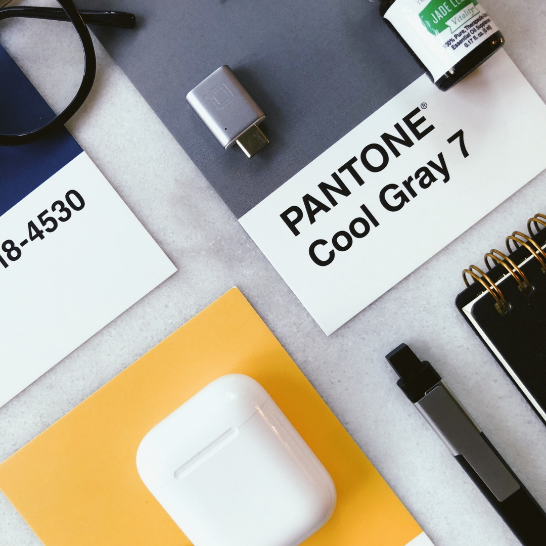
You know Coke? The vibrant red can that catches your eye and has the ability to make you thirsty even though you’ve just had a tall glass of water? You can bet your coffee money that they put that red on their vision board. The essence of a brand is its colours and the ability of colours to evoke certain emotions and perceptions. Creating a palette with your brand’s colours is so easy and can be added to your vision board like one, two, three!
Textures and patterns
Depending on what your company, one-man business, side-hustle does, you might need to add your textures and patterns (pictures thereof, of course, or if you’re doing a physical vision board you can add physical samples to it) to your vision board. This is mostly applicable to product-based companies and where textures and patterns need to be integrated into the packaging. Textures and patterns are also important to brick and mortar stores, like for wallpaper or stationery (think about letterheads and stamps).
Font type
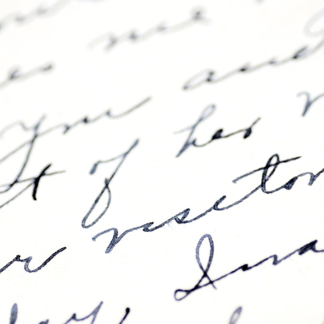
Hopefully by the time you’ve started on your vision board, you’ve decided which font (or fonts) you’ll be using. Showing this on your vision board doesn’t mean that you have to show the exact name of the font, just that you should show the shape that will represent your brand. Think about your brand identity here: is it fun, adventurous, happy? Or is it elegant, timeless, minimalist? By utilising fonts in these ways and showing your vibe, you can just further connect your aesthetics to your strategy.
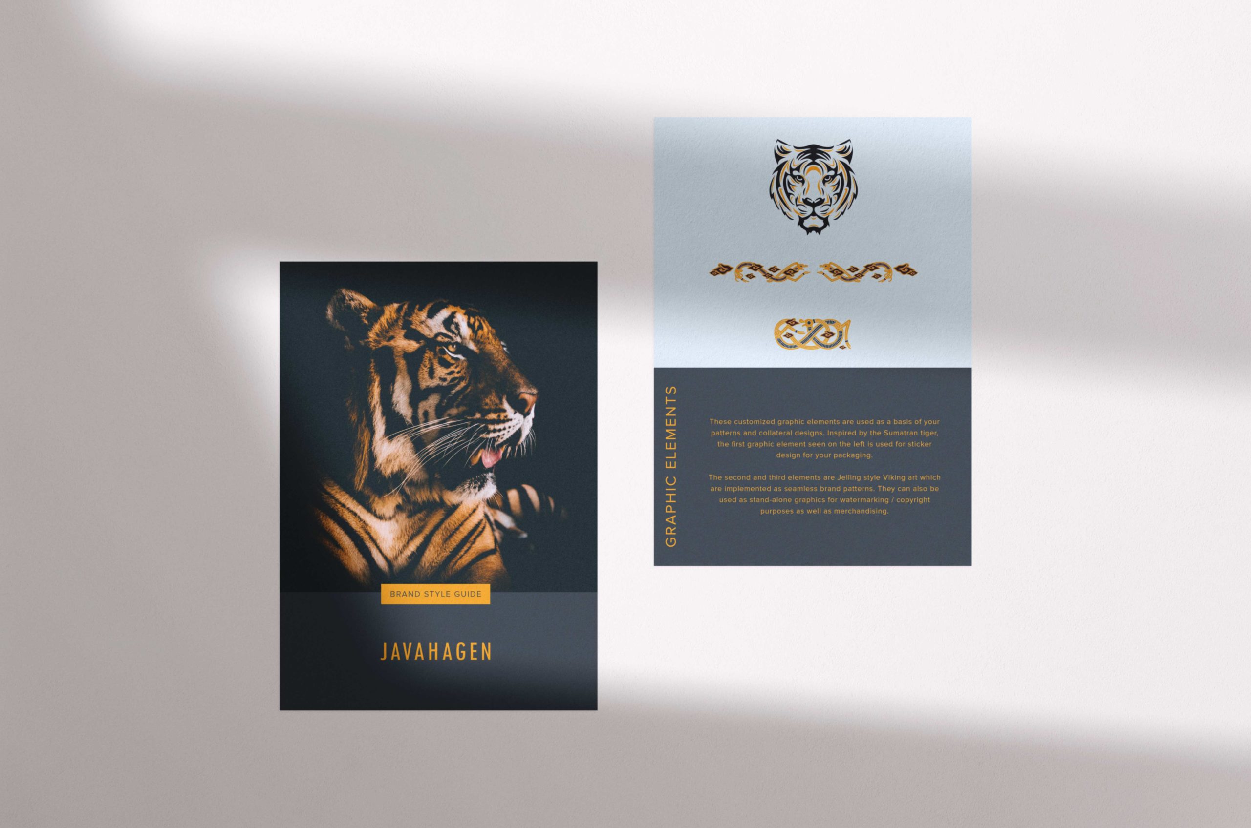
Logo Type
Logos, logos, logos! With so many logo types to choose from (iconic, typography, mascot, emblem, monogram, abstract!), it would be wise to delineate them to certain shapes before moving forward with your branding. Your logo would of course be highly interlinked with your brand message and personality.
Photography style
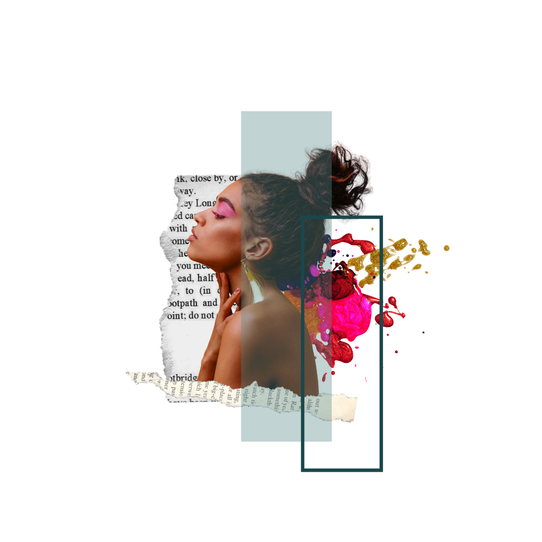
Colours alone can’t narrow down whatever vibe you’re looking for. Choosing a colour like yellow can mean a lot of things, but try implementing yellow in your graphics and photos, then you’ll get the exact feel you’re aiming for. Think about adding a sunflower as a bright, vibrant yellow representation on your vision board and then try adding a different vibe by using pastel yellow or a dark, mustard yellow.
Exciting stuff, right? Creating a vision board can be time-consuming and sometimes maddening, but it’s also super fun and full of excitement for the creator in you.These are just some things to put on your vision board and it is by no means an exhaustive list. You can browse through our older posts (especially this one here or here). And if you’re looking to rebrand, well, you know where to find us!
You might have noticed our Instagram is gone, but don’t worry, Pinterest is still going strong!
Visualise with Ease
Get your vision board freebie here for your next creative project. Pssst! It’s super easy to use – just drag and drop your images and you’re done!
TIRED OF READING? WANT MORE OF A HUMAN TOUCH? I GOT YOU.

