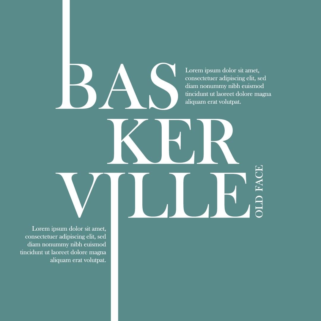
Choosing Brand Fonts

SHARE //
After a bit of a break from posting on the blog, I’m back! I’m still so excited about this whole series of posts. We here at The Mood Lab love to share tips & tricks we’ve learned over the years and we hope you’re enjoying our posts! As you’ve probably figured out from the title, I’m going to be talking about how you can choose the right fonts for your brand.
Now, choosing a font can be as easy as slipping on your favourite pair of jeans, but can be as difficult as replacing those jeans when they wear out. Your font should fit your brand perfectly as it is after all one of the first things your viewers see. When starting a new collaboration with a client, there are so many things to think about, but one very important one is that the entire brand must be aesthetically uniform. Nobody wants a confusing, mismatched brand that isn’t pleasing to the eye. There are some tips & tricks I’ve worked out over time to choose a font and I’ll be sharing them here today!
A Perfect Fit
First, I try the font on the client’s logo to see if it’s legible, no matter the size of the design or where the words are placed. This is a very basic step but it is vital. A logo is everywhere – on your business card, your website, your Facebook page, heck it’s probably your Instagram profile picture! Make sure it’s easy to read and fits on all your designs perfectly!
Legibility – make it easy for readers
Then I usually check out the font when used in, let’s say a blog post, and I try to see if it makes sense as pairs and whether it can be read properly on screen and on print. Sometimes you see something a bit hinky when the font is all over the screen and you get to work some more to make it look absolutely perfect. It’s important that your visitors can easily read your blog posts, otherwise you might lose out on your ideal visitor because it’s just too hard to read your work.
Uniformity: aesthetics are important!
As I said above, it’s important that the font fits the brand and so, one of the questions I ask myself is whether the font reflects the overall aesthetics of the brand’s personality. You don’t want the font to stand out as different and not uniform to the brand, so this is quite important. Think about it, when you go on a website, isn’t it so nice when everything looks uniform and clear? It makes browsing a pleasure and is sure to invite regular visitors.
International clients? Remember, not all alphabets are the same!
The last thing I pay attention to is whether the font can be implemented in different languages. As some custom fonts may or may not contain certain special characters, it’s important to keep different languages in mind when thinking about what font to use.

So, as you can see, choosing a font is not just about the aesthetics, but also about the practical implementation. If you’re struggling with how to go about the process, do reach out, we’d love to help! Looking for more tips and tricks? Build an authentic brand that is truly yours by following the prompts here.
TIRED OF READING? WANT MORE OF A HUMAN TOUCH? I GOT YOU.
